Client
European Union to the State of Qatar
Category
Strategy
Event Branding
Event Art Direction
Social Media
Year
2025

TARSHEED CARNIVAL

TARSHEED
CARNIVAL

Client
Kahramaa
Category
Strategy
Event Branding
Event Art Direction
Installation Design
Outdoor Adv
Social Media
Year
2025
Backstory
Kahramaa, the key player in Qatar’s water and electricity sector, launched the 8th edition of the Tarsheed Carnival. The event aimed to educate both kids and adults on sustainable living through engaging and interactive experiences. The challenge was to shift perceptions, creating a fresh, innovative experience that would capture the audience's attention and elevate the carnival beyond previous editions.
Thoughts
Over time, humanity has lost its connection to nature, treating the environment as nothing more than a simple backdrop. In nature, everything collaborates, each element plays its part in a perfect system. Except us. We've disrupted this balance, leaving the natural ecosystem incomplete.
Solution
Our mission was to create an event that showed how humanity can thrive by working with nature and not against it, aligned with Qatar’s National Vision 2030 to promote sustainability and reduce CO2 emissions. The brand identity was designed to engage both adults and children, creating a fun, immersive atmosphere while being an educational tool.

The result? The world’s first event in collaboration with nature.

/Event Branding

The Logotype

The Tarsheed Carnival logotype was designed to reflect a natural balance between simplicity and identity. We started from a clean, simple font and shaped it into more organic forms inspired by nature. To create a stronger connection with the local context, some letters also echo the shapes of Arabic script.

/Event Art Direction

ECO Branding

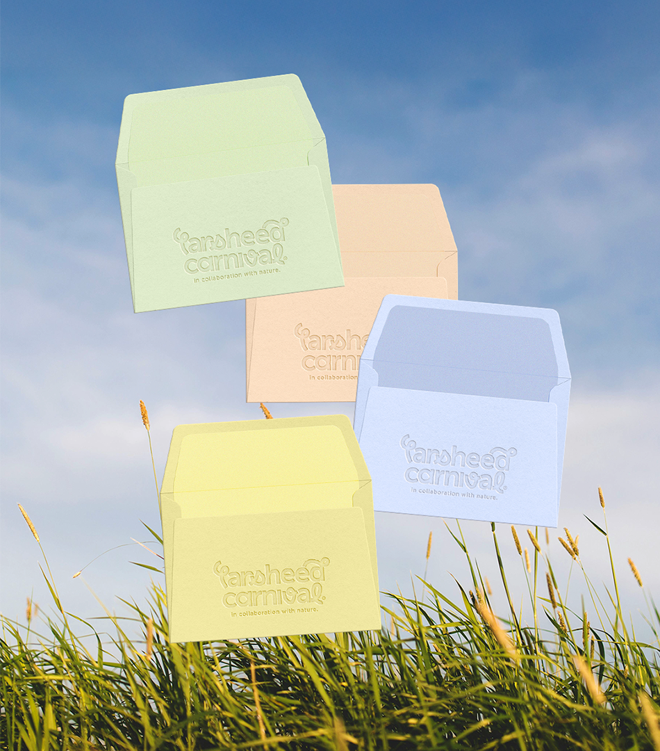
To make the branding sustainable in its application as well, we worked on the CMYK composition of the colors. In print, each color is created through the sum of Cyan, Magenta, Yellow, and Black: the higher the sum, the more ink is used. For this reason, we chose a palette with reduced values, keeping the colors around 30% to limit ink usage and reduce environmental impact without compromising the visual result.

/Event Art Direction

The Copywriting Strategy

Events about sustainability are often perceived as predictable or not very engaging. That’s why we chose a different direction: to capture people’s attention through an unexpected, almost absurd hook, designed to spark curiosity without forcing the message. From there, the experience led the audience to reflect on the small everyday actions that, when combined, can truly make a difference.

/Event Art Direction

Visuals Designed by Nature

The most important goal of this event was to reconnect people with nature. The problem is that we often started to see nature as a background, something around us, rather than something we are part of. That’s why the communication couldn’t simply show images of nature, especially if the event installations ended up covering it. The communication had to become nature itself. So we cut through panels and posters, allowing the real landscape to complete the message.

/Strategy

The event impact

Over 10 days, the event engaged more than 4,000 people, turning sustainability into a direct experience: not something to observe, but something to live, move through, and rediscover.

/Outdoor Adv

Inside The Screen

To communicate the event, we brought the same tone of voice into the digital space. Nature was not represented in a literal way, but evoked through optical effects designed to capture people’s attention and turn the message into real impact.