Client
European Union to the State of Qatar
Category
Strategy
Event Branding
Event Art Direction
Social Media
Year
2025

QATAR NATIONAL TEAM

QATAR
NATIONAL
TEAM

Client
Qatar Football Association
Category
Strategy
Brand Identity
Installation Design
Year
2025
Backstory
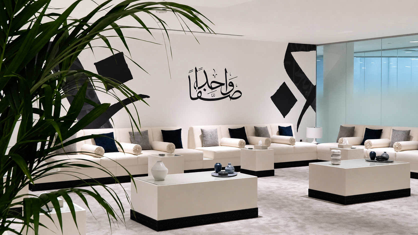
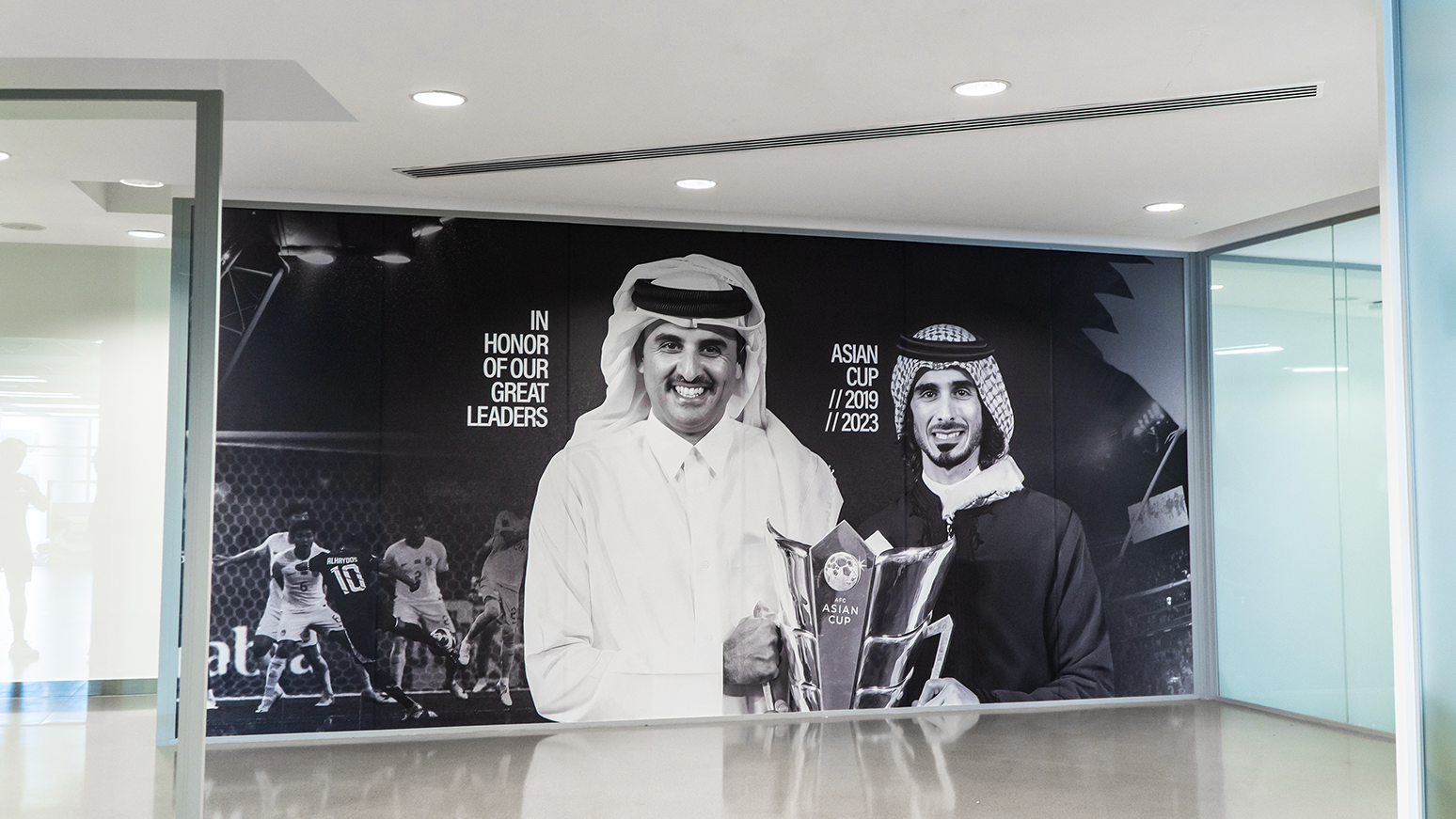
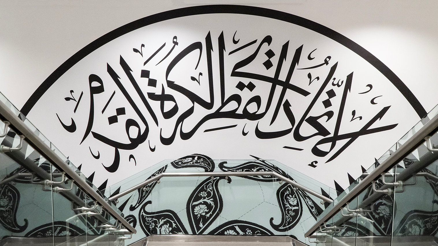
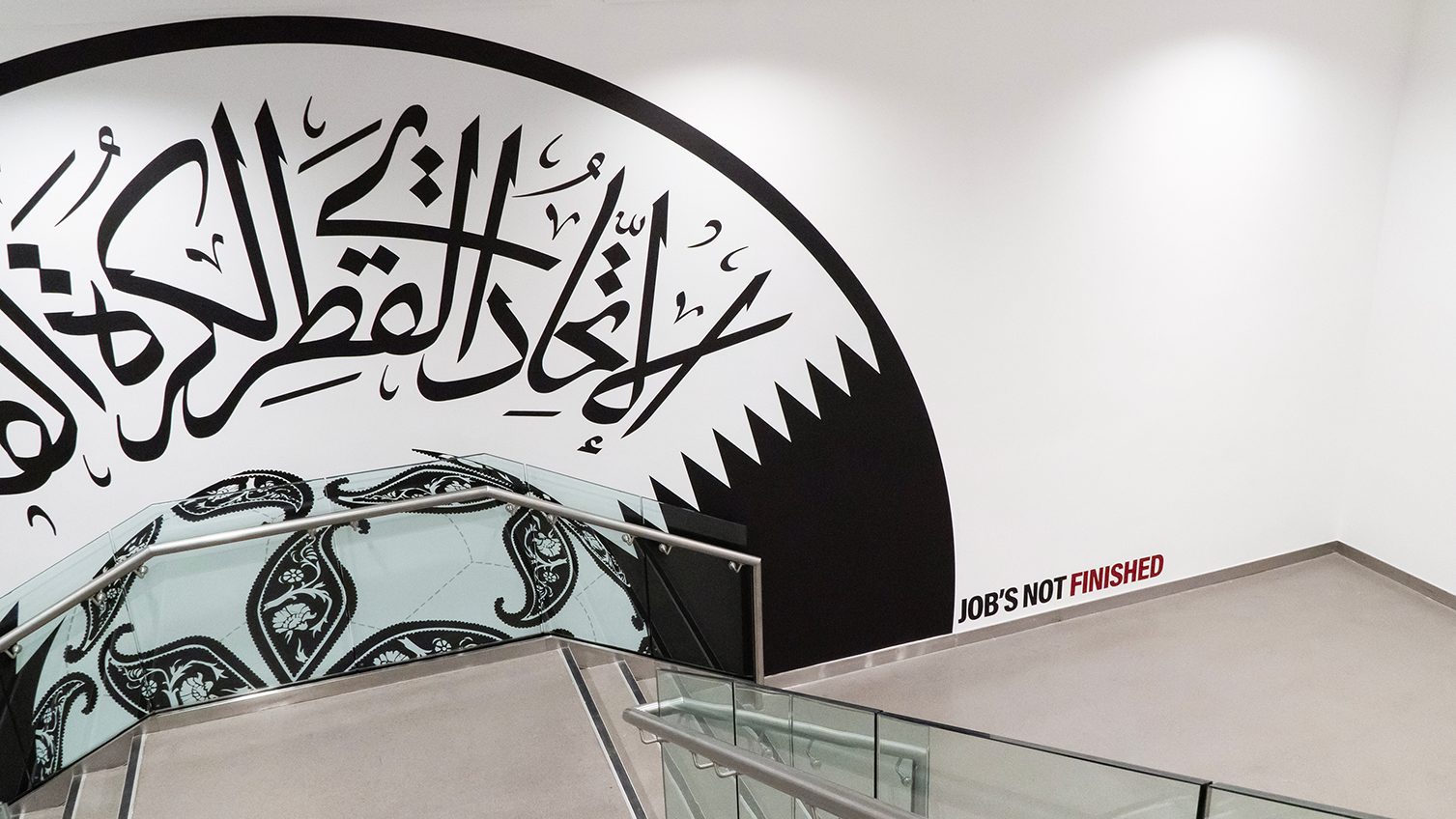
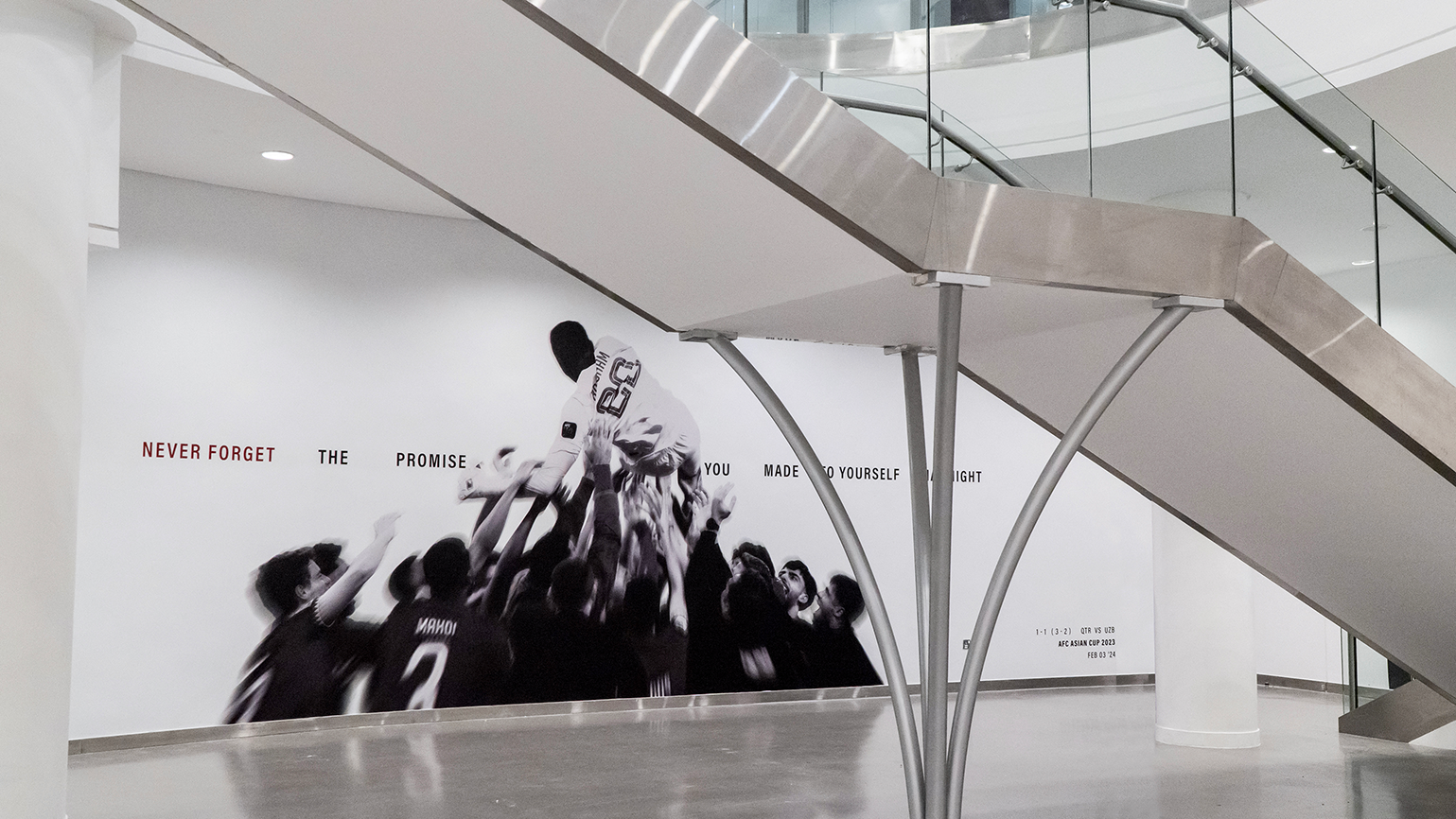
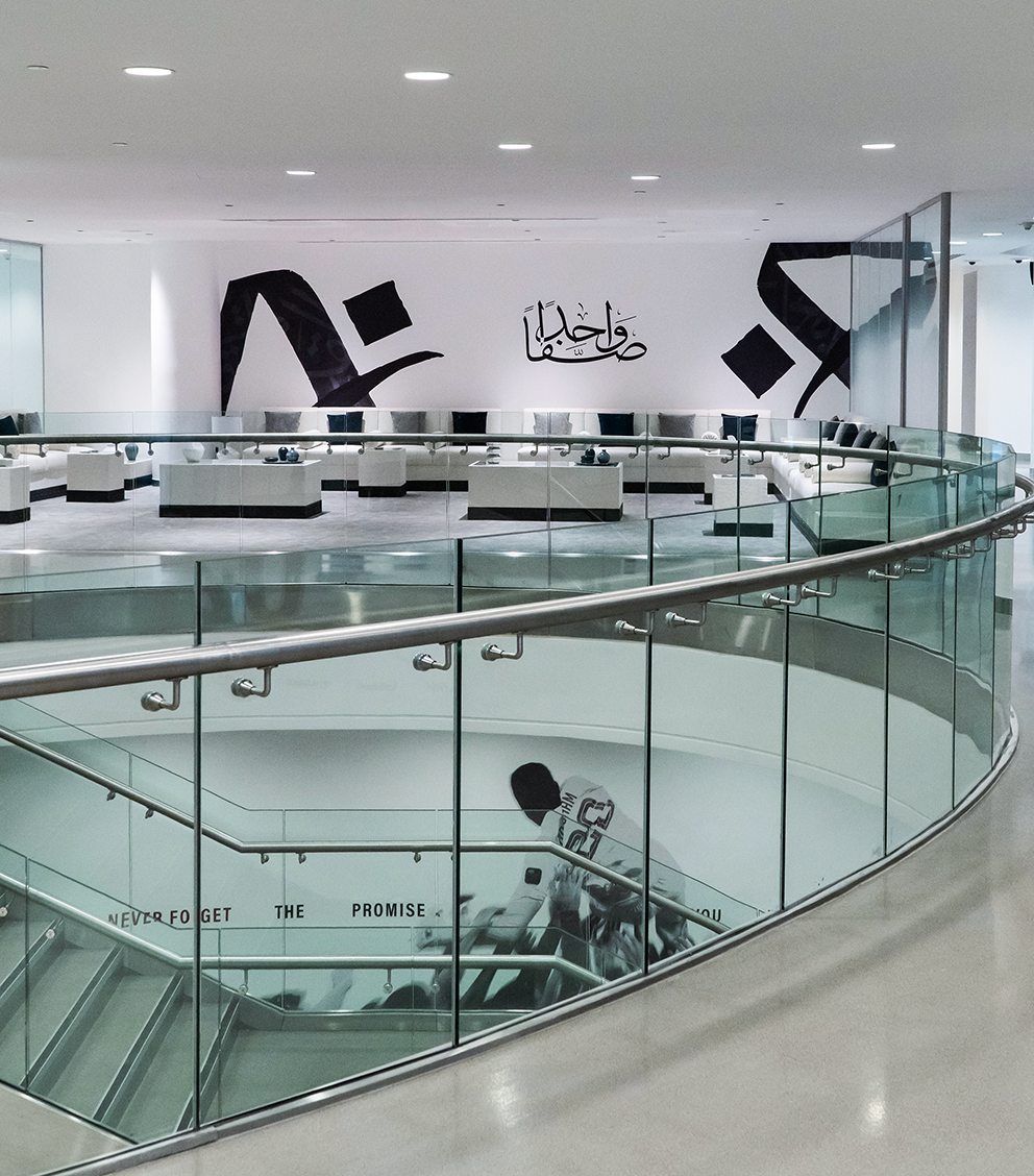
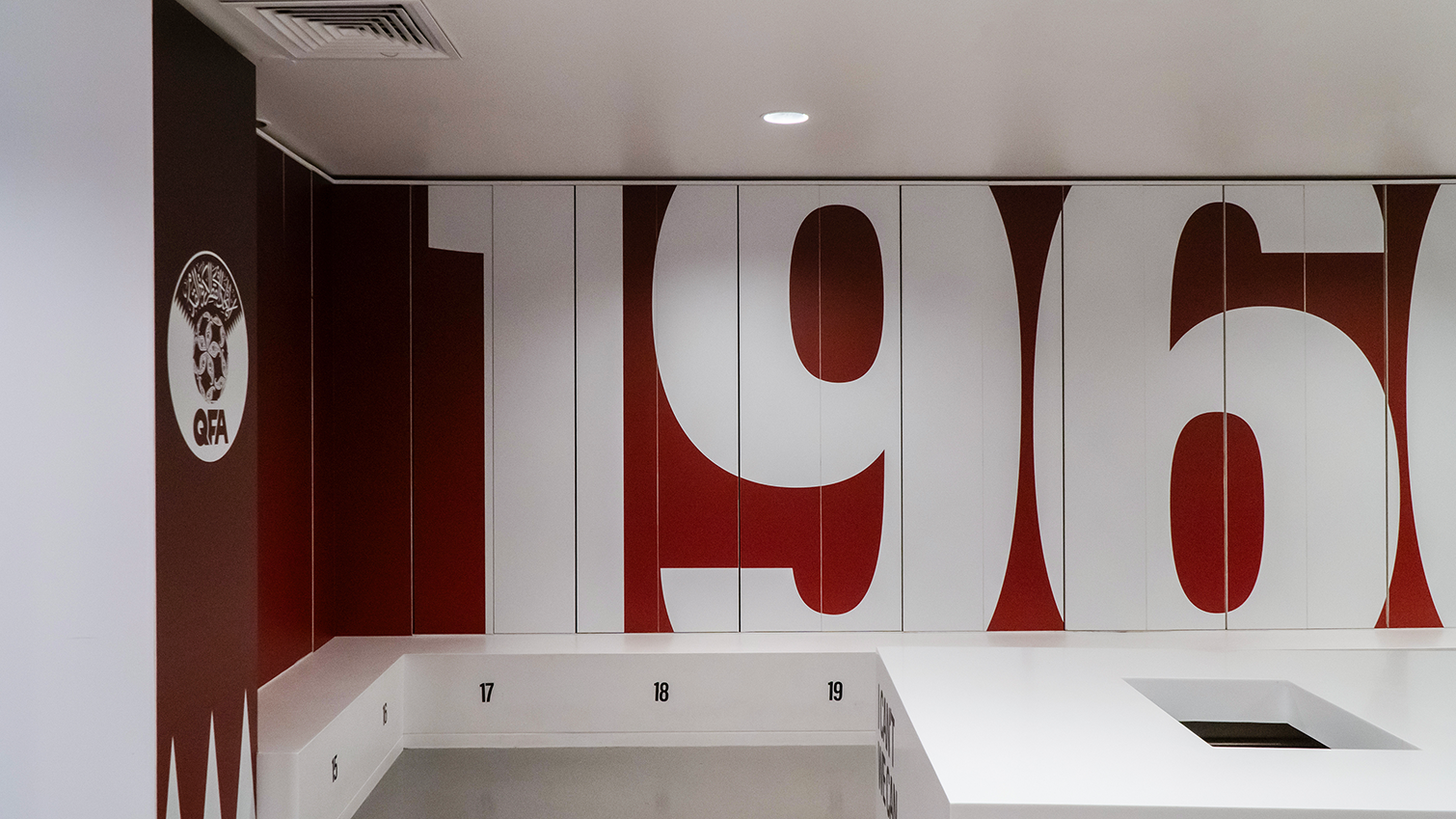
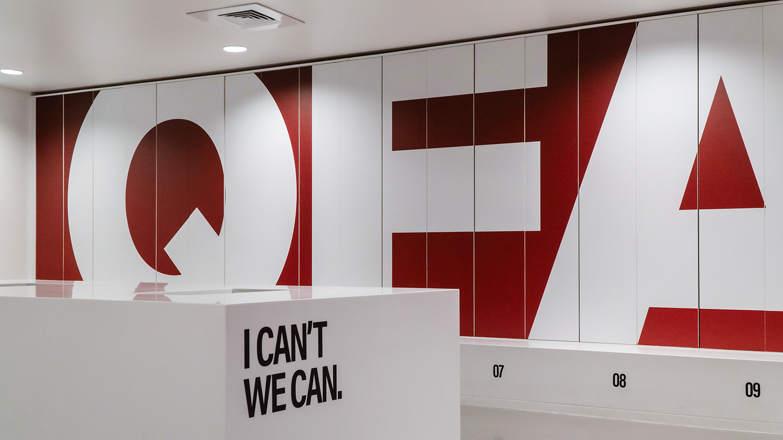
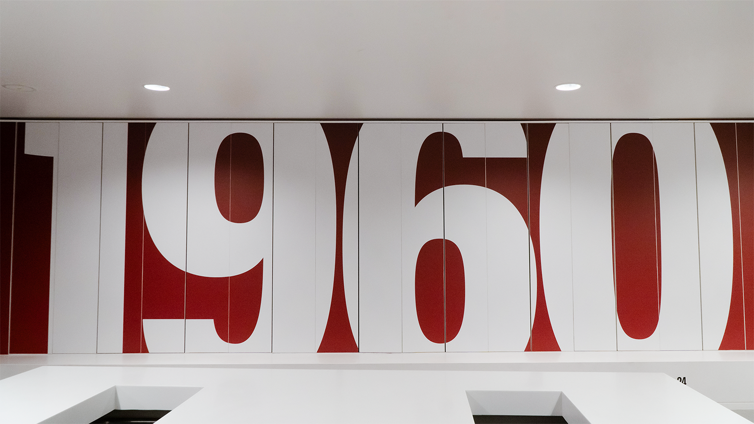
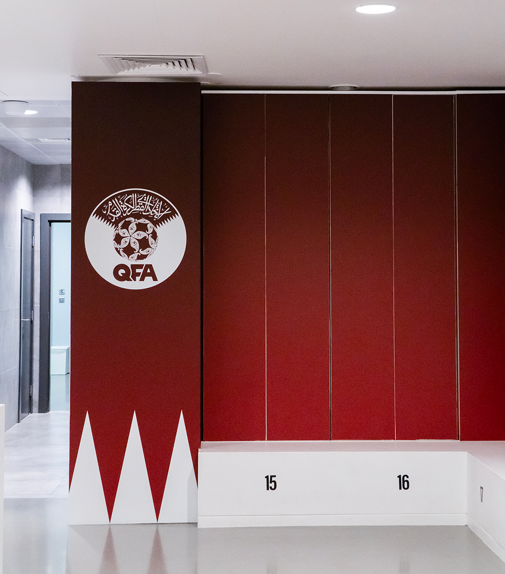
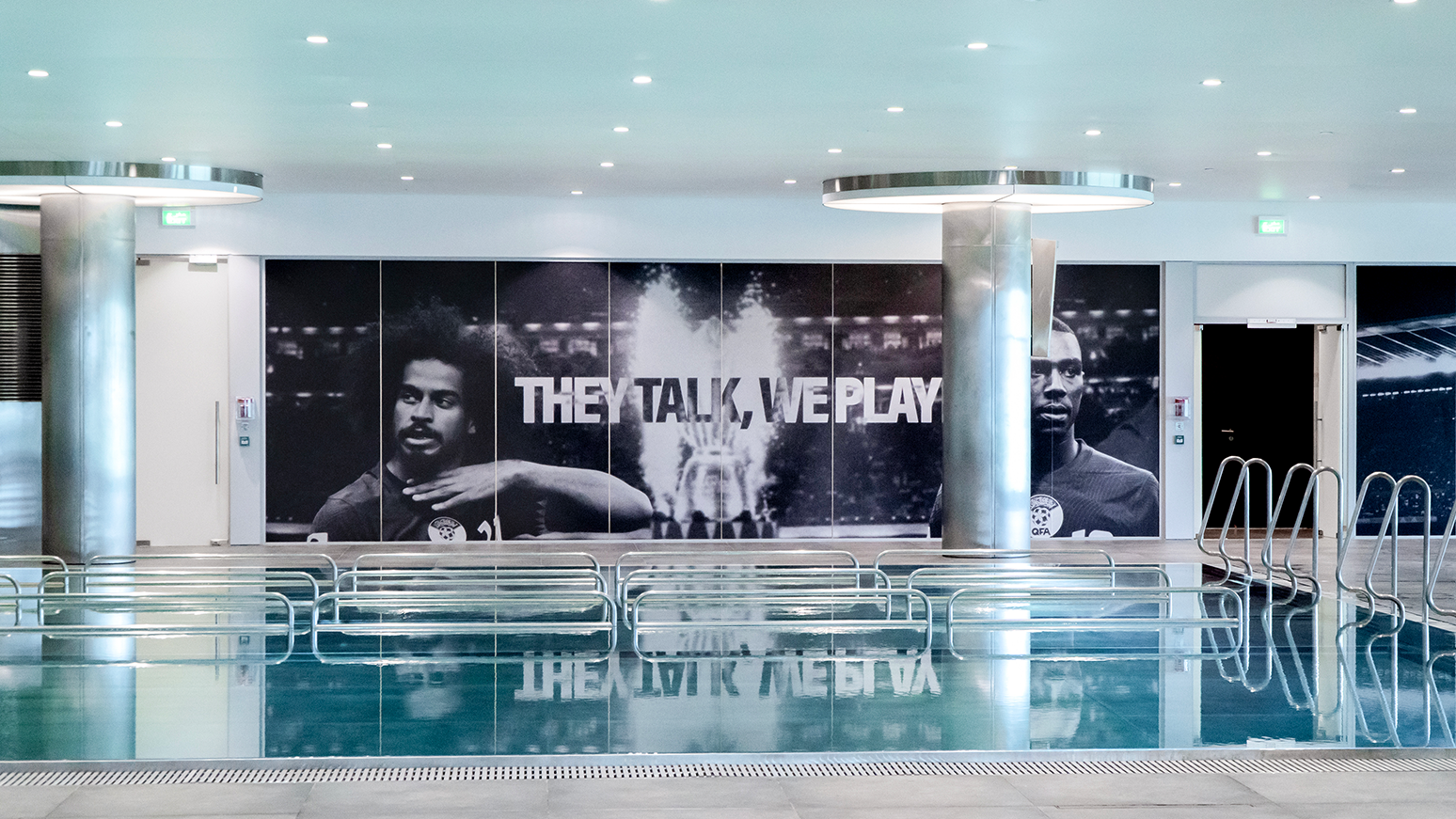
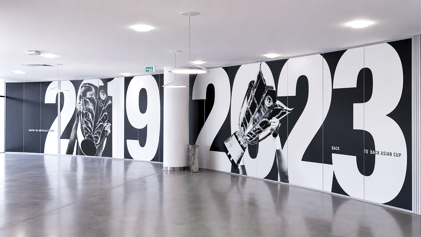
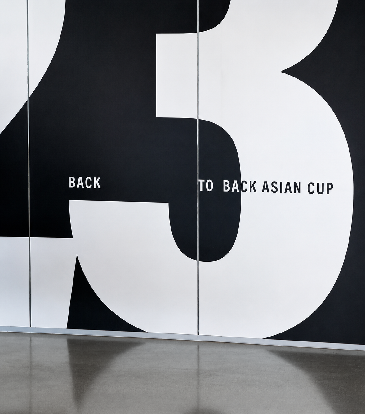
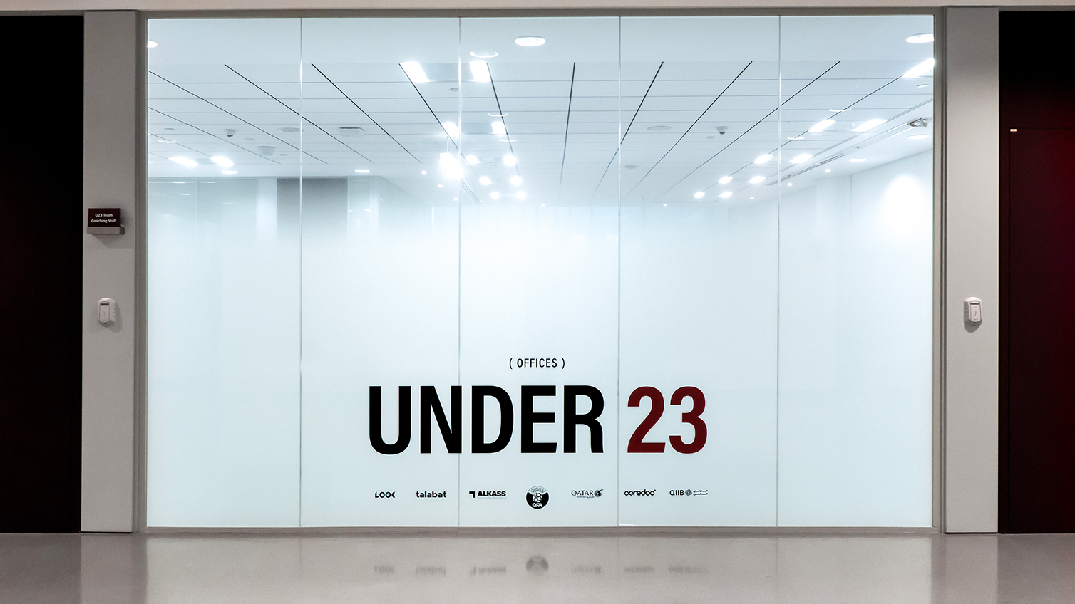
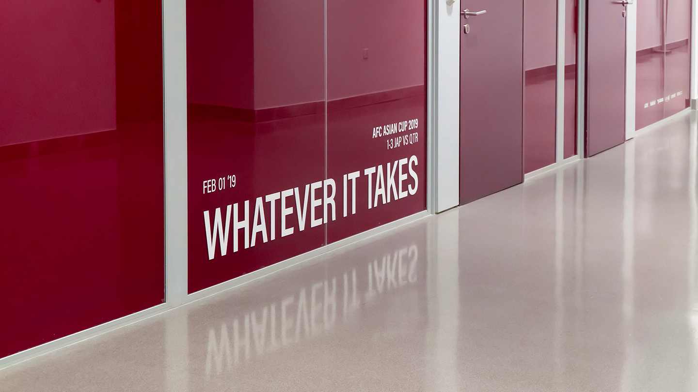
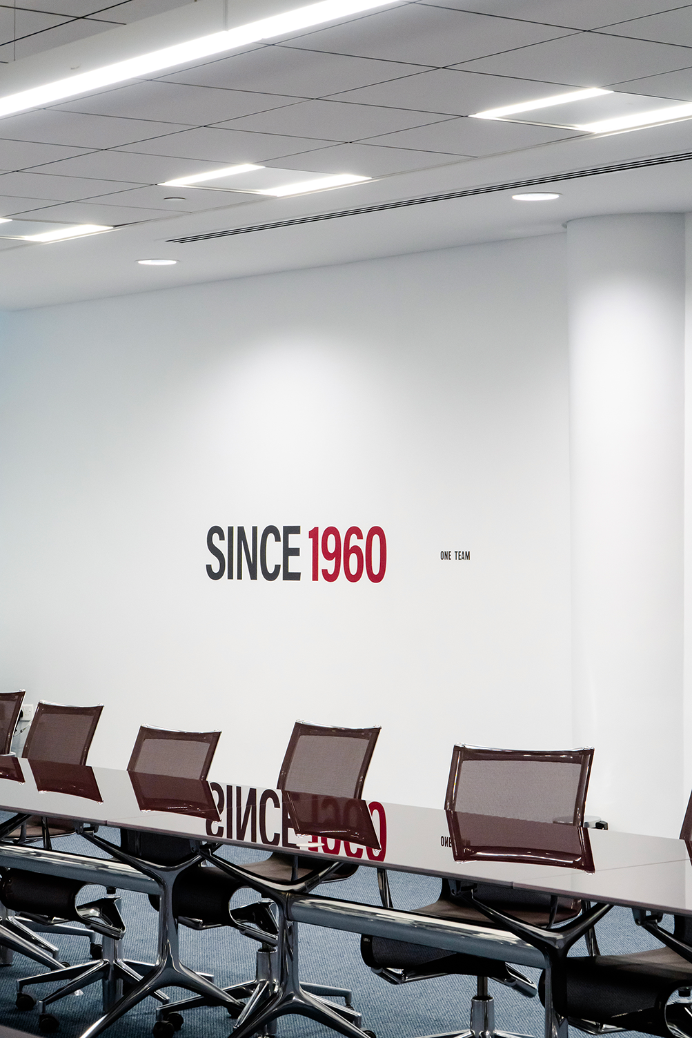
The project was developed for the QFA Headquarters, where offices, training spaces, and the Qatar National Team’s daily environment coexist. The brief was to redesign the printed visuals across the building, creating a system able to empower players, support the staff around them, remain timeless, and adapt easily to future sponsor changes.
Thoughts
The main audience is the players: young, visually sharp, culturally aware, and shaped by a fast multimedia world. They need a brand language that feels current and real, not distant or outdated. Repetition alone can flatten energy; in a high-performance space, visuals must stimulate, inspire, and reinforce the right mindset.
Solution
We built a visual direction that connects architecture, identity, and ambition. Glass, steel, maroon, and white became a palette that respects the space while adding movement and emotional drive. This is not branding as decoration, but branding as direction: every element pushes toward one action only — playing to win.

/Installation Design

The Great Leaders

A timeless black and white visual created to celebrate QFA’s leadership and achievements. The trophy, match moments, and institutional tone turn the wall into a daily reminder of pride, legacy, and the ambition to keep winning.

/Installation Design

The Majlis

Created for the majlis, this visual uses Quranic calligraphy to bring a sense of respect, wisdom, and cultural depth into the space. The handwritten-inspired forms extend the movement of the Arabic script across the wall, creating an elegant atmosphere rooted in heritage, hospitality, and belonging.

/Installation Design

Job's not finished

The team logo is intentionally shown incomplete, turning absence into meaning. It reflects the message on the wall: the work is not over. Bold and direct, the visual becomes an empowering reminder that past achievements are only part of the journey, and the mission continues.

/Installation Design

Empowering the Team

The visual turns a moment of victory into motivation. The celebration captures the emotion of achievement, while the message reminds players of the promise they made to themselves that night. It uses success not as an endpoint, but as fuel to keep pushing forward.

/Installation Design

The National Team Lockers

The locker room uses oversized QFA lettering to turn the space into a bold expression of identity. The fragmented scale works with the lockers’ structure, while the maroon and white palette keeps it clean, strong, and connected to the team. The message “I can’t. We can.” reinforces the idea of unity before performance.

/Installation Design

The Pool Area

Placed in the pool area, the visual uses a strong and direct message to reinforce focus. The players’ portraits and the match atmosphere create intensity, while the line “They talk, we play” shifts attention away from noise and pressure, bringing it back to performance, discipline, and action.

/Installation Design

The Restaurant Area

A visual celebration of back-to-back victories, built to remind players what has been done — and what can be done again.

/Installation Design

The Offices

For the offices glazing, the frosted treatment creates privacy without making the space feel closed. The upward gradient keeps the environment light and open, while the typography adds a clear layer of identity and motivation. It turns the glass into a functional branding element that balances clarity, elegance, and purpose.

/Installation Design

The Meeting Room

The visual brings energy into the meeting room. The motion blur emphasizes speed, focus, and action, while the player becomes a symbol of determination. The minimal composition keeps the space elegant, but adds a strong reminder of the mindset behind every decision: playing to win.